Custom Hang Tag: Product Labeling
A custom hang tag does three jobs at once: it identifies the product, carries the scanned barcode and compliance copy, and sells the brand in the five seconds before purchase. A retail-ready tag needs six content blocks plus a scannable GTIN.
The hang tag is the smallest surface in a custom pet carrier program and the one most likely to be read at the moment of purchase, which is why it deserves the same design attention as the product. This guide covers the tag as a communication object: its information architecture, the six content blocks every retail-ready tag should carry, board stock and structure, finishes, attachment method, barcode specification, market-specific compliance statements, sustainability claims and the ordering cycle. It also covers the tag as part of a system alongside the woven label, the care label, the retail box and the insert card - because when those four share one typographic and colour language, the product reads as designed rather than assembled. Commercial floor is MOQ 500 pieces per colourway; sample rounds run 6-10 working days each; bulk production runs 35-50 days after sample approval and deposit; and every shipment releases against an AQL 2.5 inspection report before cartons close.
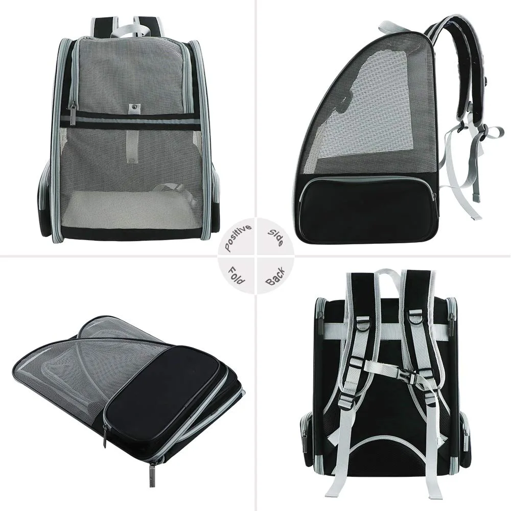
When a custom pet bag has to ship flat, the pattern changes: removable stiffeners and a fold line that does not crease the coated face.
The Hang Tag's Three Jobs - and Why One of Them Is Usually Ignored
A hang tag is asked to do three things simultaneously, and most programs design for one of them. Understanding all three is what turns a tag from a label into a selling tool.
The first job is identification. The tag states what the product is, which size it is, which colourway it is, and what it is made of. This is the administrative layer, and it is what retail systems and customers read when they need facts. It must be complete and it must be legible at arm's length.
The second job is transaction. The tag carries the barcode that makes the product scannable at a till and traceable through a distribution network. A tag that looks beautiful but scans poorly is a tag that will be rejected by a retailer, and barcode failures are among the most common causes of a delayed launch.
The third job is persuasion, and it is the one usually ignored. In the five seconds a customer holds the product, the tag is the only surface that can carry a reason to buy: the material story, the design intent, the care promise, the sustainability claim. A tag that only lists facts has wasted its most valuable space.
The design resolution is hierarchy. Give the brand mark and one persuasive line the front face, give the product facts and barcode the back face, and keep the compliance block compact but complete. Two faces, two jobs - and a clear rule about which content wins when space runs out.
Information Architecture: Six Content Blocks in a Fixed Order
Information architecture on a tag is a solved problem, and deviating from the solved version causes confusion at shelf and at the till. Six blocks, in a consistent order, cover every requirement.
Block one is the brand and product name, set in the brand's typography. This is the recognition anchor and should be the largest element on the front face after the mark itself.
Block two is the product descriptor: size and colourway, expressed in the brand's own naming convention. "Medium / Slate" communicates and sells; "M / BLK-01" does neither. Naming should be fixed before packaging artwork starts, because renaming a colourway after the tags are printed means reprinting them.
Block three is the material and construction statement: shell composition, lining composition, and any material claim the brand wants to make, such as recycled content or an OEKO-TEX certified fabric. Keep claims precise and defensible, because vague environmental claims are increasingly challenged by retailers and regulators.
Block four is care: washing, drying and any specific instruction such as removing the internal board before washing. Symbols plus a short line of text work better than text alone, especially for international distribution.
Block five is origin and identification: country of origin, and the GTIN barcode with its human-readable number beneath. Block six is the regulatory and contact block: the market-specific statement required by the destination, plus the brand's address or web reference.
Set these six in the same order on every tag in the line. Consistency is what makes a range look like a range, and it makes future artwork updates a template edit rather than a redesign.
Stock and Structure: Board Weight, Shape and Die-Cut
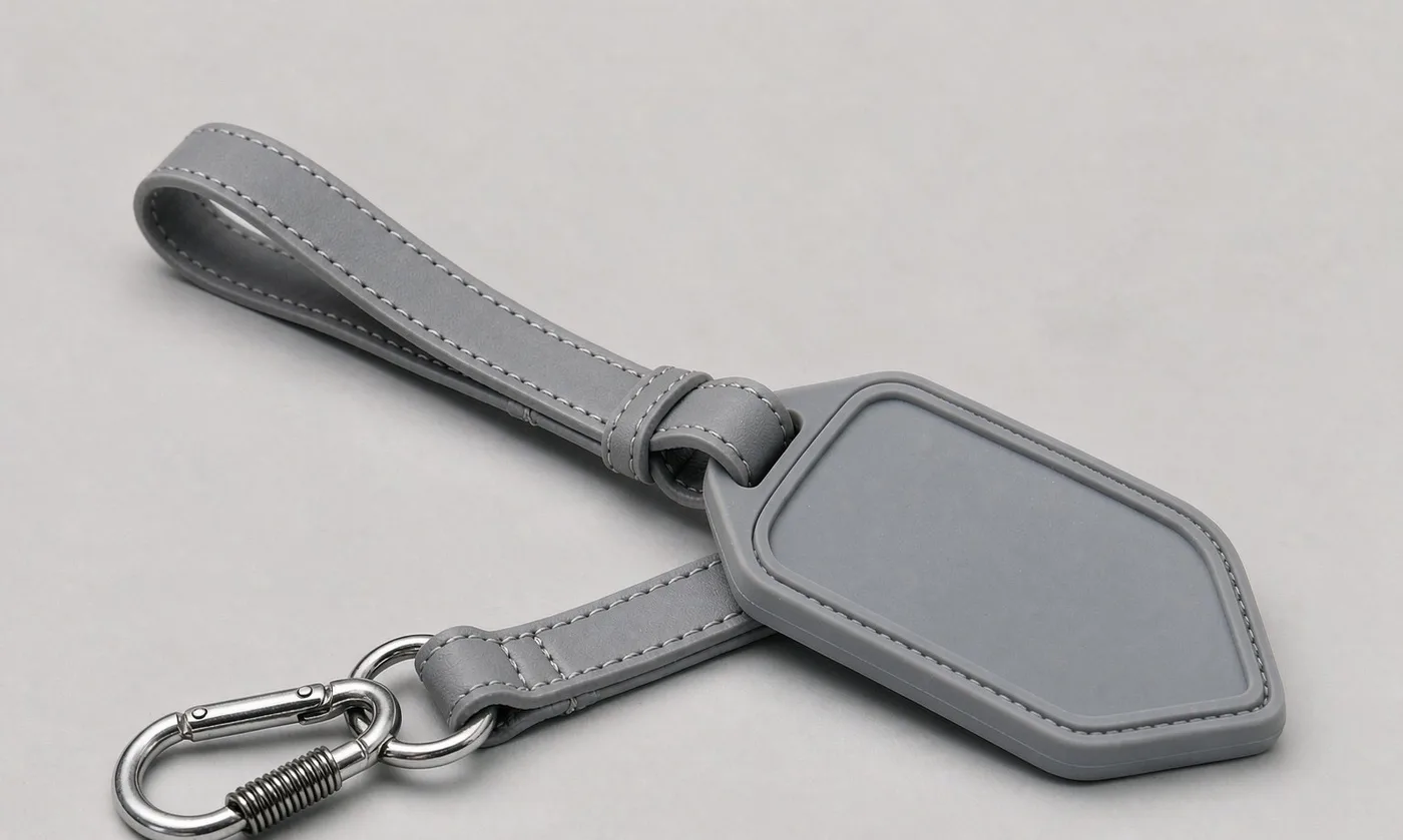
Stock choice is felt before it is read. A customer picking up a product registers the tag's weight, stiffness and edge quality within about a second, and that impression transfers directly to the product.
Coated art board in the 300-400 gsm range is the standard for a printed brand tag: it holds four-colour artwork crisply, laminates well, and has enough stiffness to hang properly. Uncoated kraft in a similar weight reads natural and sustainable, costs less, and needs artwork adapted to its absorbency - thin hairlines fill in and light tints shift warm.
Specialty stocks are where a tag becomes memorable: cotton rag paper for a heritage feel, recycled board with visible fibre for a sustainability story, or a coloured core board that shows a contrasting edge when die-cut. These cost more per unit and usually carry higher minimums, but on a premium or collaboration drop the increment is small relative to the impression.
Shape and die-cut are inexpensive ways to add character. A rounded corner, a notched corner, a shaped silhouette following the logo, or a die-cut window that reveals the product behind the tag all differentiate at minimal cost - a custom die is a one-off charge, not a per-unit one.
Size should follow content, not habit. Most pet carrier tags work at roughly 50 x 90 mm to 60 x 120 mm. Oversized tags look promotional and catch on shelving; undersized tags cannot carry the compliance block legibly. Test the actual printed tag at the actual size, because screen mock-ups flatter small type.
Sample the stock before committing: a board that feels right as a swatch can behave differently once printed, laminated and die-cut, and the finished tag is the only honest test.
Finishes: The Small Budget That Changes the Whole Impression
Finishes are the highest-leverage spend on a tag, because a tag is small and a finish is noticed up close. One well-chosen finish does more than a larger tag.
Matte lamination is the default and the safest choice: it protects the print, gives a soft, modern surface, and reads premium. Gloss lamination is bolder and more retail-generic, and it shows fingerprints. Soft-touch lamination is the tactile upgrade - a velvet-like surface that customers notice immediately and associate with higher price.
Foil blocking in gold, silver or a brand metallic is the classic premium signal and works particularly well on a dark or kraft ground. It is applied as a separate pass and priced by area, so a foil logotype is affordable while a full foil field is not.
Embossing or debossing adds relief without colour, and blind deboss on uncoated stock is one of the most restrained, confident finishes available. Spot UV over a matte laminate creates a gloss-on-matte contrast that catches light on the logo only, which is the most effective way to draw the eye to the mark.
Edge and detail finishes complete the picture: rounded corners, drilled and reinforced eyelets, and edge painting on thick board. One caution - finishes compound. Foil plus emboss plus spot UV plus soft-touch is expensive and usually looks anxious. Choose one hero finish and support it.
Finish choice should also follow the channel. A soft-touch or foil tag performs well in an unboxing photograph, while a scuff-resistant matte laminate performs better in a store where the product is handled many times before it sells.
Attachment: String, Pin, Eyelet and Seal
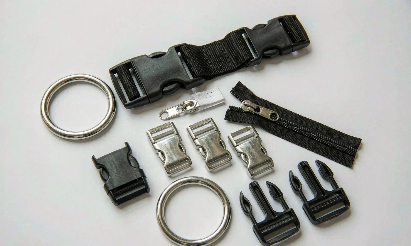
Attachment is the least glamorous part of a tag and the most likely to fail in transit. A tag that arrives detached cannot be sold at full price, and re-tagging at a distribution centre is a real cost.
String attachment is the classic solution. Cotton twine suits natural and heritage positioning; waxed cotton reads craft; elastic cord allows the tag to be pulled away from the product for inspection and return. Knot security matters more than appearance - a slipping knot produces detached tags in transit.
A plastic fastener or pin is the retail workhorse: fast to apply, secure, and accepted by most retailers. It reads less premium, which is why it is often paired with a higher-quality tag rather than replacing one.
Eyelets matter whenever a string passes through board: a reinforced metal or paper eyelet stops the string tearing through under the product's weight in transit. On heavier boards and on kraft stock, an unreinforced hole is a genuine failure risk.
Seals and stickers are the flexible option for multi-tag sets or for adding a colourway-specific mark without printing a second run: a printed seal applied to a generic tag. This is a common approach for seasonal colourways, where the base tag is printed once and the seal changes.
Where the program also uses an insert card, coordinate the two: one voice, one typeface, one accent colour, and one call to action rather than three competing ones. Our insert card guide covers that sequence in detail.
Whichever method is used, apply one to a fully packed product and shake the carton; a tag that survives that test will survive distribution, and one that does not will not be saved by a stronger knot.
Barcode, Compliance Copy and Market Statements
The administrative layer is where launches are delayed, and it is almost entirely avoidable with early planning. Three items need decisions well before artwork is final.
First, the GTIN. Each SKU - each size-by-colourway combination - needs its own number, and the barcode must be printed at a scannable size and contrast. Quiet zones, magnification and contrast are specified in the artwork, not left to the printer. A light grey barcode on kraft is a barcode that fails at a till, and a failed scan at launch week costs more than the whole print run.
Second, the market-specific statements. Programs sold into California are commonly asked to address Proposition 65, and the authoritative guidance is published by the state agency at OEHHA. General consumer product safety expectations in the United States are administered by the U.S. Consumer Product Safety Commission, and European programs are screened against REACH substance restrictions. The destination list must be declared before materials are booked, because a late market change can invalidate an approved material set.
Third, the textile and material claims. Where a retail buyer requires documented textile safety, fabrics and yarns can be supplied to OEKO-TEX Standard 100 and the certificate numbers can be referenced on the tag. Claims must be accurate and current - an expired certificate number on a tag is worse than no claim at all.
Finally, carton and packing: retailers specify carton labels, packing counts and sometimes pallet patterns. Request the vendor guide early and build the carton specification from it rather than discovering the requirement after production.
Sustainability Claims: Credible, Specific and Defensible
Sustainability content on a hang tag is now expected by many retail buyers and by a growing share of customers, but it is also the area where brands get into trouble. The rule is simple: claims must be specific, verifiable and scoped.
Specific means naming the material and the proportion. "Recycled polyester shell" is a claim; "made with post-consumer recycled polyester equivalent to eight bottles" is a specific, defensible one. Vague terms - eco, green, earth-friendly - are increasingly rejected by retailers and are, in several jurisdictions, legally risky.
Verifiable means having the document. A recycled content claim should be supported by a transaction certificate or a recognised standard; a certified fabric claim should carry a valid certificate number. Our team collects certificate numbers at sample stage rather than at shipment, because a certificate that arrives late cannot fix a rejected delivery.
Scoped means saying what the claim covers. If the shell is recycled but the lining and hardware are not, the tag should say the shell is recycled. Overstating scope is the fastest way to lose a retail account.
The stock itself is part of the claim. Recycled or FSC-sourced board, soy-based inks, and the removal of a plastic laminate all support a genuine story, and they should be stated as facts rather than as adjectives. Where a plastic fastener is replaced with a paper tie or an unbleached cotton string, that is a real, communicable change.
Design-wise, keep sustainability content to one short block. A tag that lectures reads as defensive; a tag that states two facts and moves on reads as confident.
Design System, Cost and the Ordering Cycle
A tag should not be designed in isolation. It belongs to a small system - woven label, care label, hang tag, retail box and insert card - and the system is what makes a product look considered.
One typeface family, one accent colour, one logo clear space and one photographic style across all five elements is usually enough. The tag then inherits recognition from the product and reinforces it at shelf, rather than introducing a second visual language at the last moment.
Cost is driven by stock, size, print colours, finishes and quantity. Finishes carry per-pass charges and sometimes minimums; die-cutting is a one-off tooling charge; and quantity is the biggest lever, because print set-up dominates at low volumes. Specialty stocks and foils carry the highest minimums, so a collaboration drop is the natural place to use them and a core drop is not.
The ordering cycle runs alongside product sampling. Artwork is developed against final exterior dimensions and the confirmed colourway names, a printed proof is approved on the actual stock, and the tags are produced in time to be applied at packing. Sample rounds for the program run 6-10 working days each; bulk runs 35-50 days after approval and deposit.
| Tag specification | Core drop | Seasonal drop | Collaboration drop |
|---|---|---|---|
| Stock | 350 gsm coated board | 350 gsm recycled board | Cotton rag or coloured core |
| 4 colour, double sided | 4 colour plus one spot | 4 colour plus metallic | |
| Finish | Matte lamination | Matte plus spot UV | Soft-touch plus foil |
| Shape | Standard die, rounded corners | Custom die | Custom die plus window |
| Attachment | Recycled paper tie | Cotton twine | Waxed cord, reinforced eyelet |
| Compliance block | Full six-block set | Full six-block set | Full set plus numbering |
Release is then governed by inspection: an AQL 2.5 final random inspection with a written report covering print quality, barcode scannability, attachment security and tag-to-product matching, with the quality management system behind production maintained to ISO 9001 requirements.
Hang Tags for E-commerce-Led Brands
A brand selling mostly online faces a different tag problem: nobody scans the barcode at a till, but everybody photographs the product. The tag therefore shifts from a transaction tool to a content object, and its design priorities change accordingly.
The front face becomes the priority. In an unboxing photograph, the tag is often the closest object to the camera and is frequently in focus while the product is not, which means the mark, one line of voice and one clear claim carry disproportionate weight. Set them large and keep the rest off the front.
The barcode moves to the back and can be smaller, since it is scanned in a warehouse rather than at a till. However, it still needs to scan first time, because a failed scan in a fulfilment centre causes a picking error that costs more than the tag.
A QR code earns its place on an e-commerce tag. Link to sizing guidance, which reduces returns; to a care page, which reduces support contacts; or to a registration page, which builds the customer list. One code, one destination, with a short line of text stating what the customer gets.
Material choices shift too. Because the tag is handled rather than hung, soft-touch coating, rounded corners and a reinforced eyelet matter more, and a heavier stock survives the journey better. And because the tag is photographed, finishes that catch light - foil, spot UV - perform better on camera than they do on shelf.
Finally, treat the tag as a review prompt surface. A single line inviting a review, with one clear destination, placed where it is read after the customer has used the product, is the highest-converting use of tag space for an online brand.
Tag copy across marketplaces and retail channels
A brand selling through its own site, through marketplaces and through independent retailers needs one tag that satisfies all three, and the constraints are not identical.
Marketplaces generally care about identification: a scannable barcode, a clear size and colourway, and content that matches the listing exactly. A mismatch between tag copy and listing copy causes returns and account warnings, so the colourway name on the tag must be the name used in the listing.
Independent retailers care about presentation and about whether the tag will survive handling. A heavier stock, a reinforced eyelet and a secure attachment matter more here, because the product will be picked up many times before it sells.
The brand's own channel cares about the story, which is where the front-face line and the QR code earn their place. The resolution is a single layout with a fixed information block for channels and a variable front face for story - one print run, three requirements met.
Typography and colour on a small surface
Small surfaces punish type and reward restraint, and most tag artwork fails for typographic reasons rather than graphic ones. Four rules prevent the common failures.
Choose a typeface with open counters and a sturdy regular weight, because fine hairlines fill in on absorbent stock and light weights disappear at 6-8 point sizes. Set no lower than 6 point for compliance copy and no lower than 8 point for anything a customer is expected to read.
Limit the hierarchy to three levels - mark, headline, detail. A tag with five type sizes looks busy and reads as though nothing is important. Use space rather than size to separate blocks; generous margins do more for legibility than larger type.
Use one accent colour and let the rest be neutral. A tag with four colours at small sizes reads as noise, and it also creates opportunities for registration error. Where the brand system has several accent colours, pick one per season and use it consistently across the tag, the insert card and the carton.
Finally, proof at actual size on the actual stock. A design reviewed at 200 percent on a screen will pass checks that the printed tag fails, and the printed proof is the only honest test.
Tag formats: single, folded and booklet
Three formats cover most programs, and the choice is driven by content volume rather than by style.
A single flat tag suits a focused brand with six content blocks and no long copy. It is the cheapest, packs flat, and hangs cleanly. A folded tag - a single fold creating four faces - doubles the content area for a modest cost increase and is the right answer when a second language block or a longer material story is needed.
A booklet tag, with several stapled or bound leaves, is used for premium or technical products and for brands that want to include a story, a care guide and a warranty statement in one object. It costs materially more, adds weight, and is only justified when the content genuinely earns the space.
The rule of thumb: start single, move to folded when content outgrows the face, and reserve the booklet for a hero or collaboration product where the packaging is part of the proposition.
Order and quality terms
- MOQ 500 pieces per colourway; samples in 6-10 working days
- Bulk production 35-50 days after approval; AQL 2.5 inspection standard
- T/T 30/70 terms, FOB Xiamen, full document set per shipment
People Also Ask
What size should a hang tag be?
Roughly 50 x 90 mm to 60 x 120 mm for a pet carrier. Larger tags look promotional and catch on shelving; smaller ones cannot carry the compliance block legibly.
Is a woven label or a hang tag more important?
They do different jobs. The woven label carries permanence and is seen in use; the hang tag carries identification, the barcode and the purchase argument at shelf. Retail-ready programs need both.
What board weight is best for a hang tag?
300-400 gsm for coated art board or kraft. Below that the tag bends and looks cheap; above it, the tag is stiff enough to catch on shelving unless corners are rounded.
Can a hang tag include a QR code?
Yes, and it is a good use of space: link to sizing guidance, care instructions or a registration page, and keep one clear call to action rather than several.
How do I make a hang tag look premium on a small budget?
Choose one hero finish - matte lamination plus spot UV on the logo is the most effective combination per dollar - and keep the stock heavy and the type restrained.
Do hang tags need to match across a product line?
Yes. Consistent typography, colour accent and content order across the line is what makes a range read as a range and makes future updates a template edit.
Frequently Asked Questions
What information must a pet carrier hang tag carry?
Six blocks: brand and product name, size and colourway, material and construction statement, care instructions, country of origin and GTIN barcode, and the market-specific regulatory block with the brand's contact reference.
What is the MOQ for custom hang tags?
Tag print runs are booked in quantities that cover a season, because print set-up dominates at low volumes. The wider program floor is MOQ 500 pieces per colourway.
Can we use recycled or FSC board?
Yes. Recycled and FSC-sourced board is available in standard weights, and soy-based inks and plastic-free laminates can be specified to support a genuine sustainability claim on the tag.
How do we make sure the barcode scans?
Specify magnification, quiet zone and contrast in the artwork and test a printed proof with a scanner rather than a phone app. Light ink on kraft is the most common failure.
Do we need a Prop 65 statement?
If the product is sold into California, discuss the requirement with your compliance advisor; the state authority publishes guidance at OEHHA. Destination markets should be declared before materials are booked.
What finishes are available on a hang tag?
Matte, gloss or soft-touch lamination, foil blocking, blind or coloured emboss and deboss, spot UV, rounded or custom die-cut shapes, and reinforced eyelets.
How is the tag attached?
Cotton twine, waxed cord, elastic cord, a recycled paper tie, or a plastic fastener. Reinforced eyelets are recommended on heavy board and on kraft stock to stop tearing in transit.
Can we print a different tag for each colourway?
Yes, though each version carries its own print run. A common approach is one base tag plus a colourway-specific printed seal, which avoids a second full run.
Can sustainability claims go on the tag?
Yes, provided they are specific, verifiable and scoped: name the material and the proportion, support it with a current certificate, and state exactly which components the claim covers.
How long does tag artwork take?
Artwork is developed against final exterior dimensions and confirmed colourway names, usually alongside the second sample round of 6-10 working days, with a printed proof approved on the actual stock before the run.
Should the tag match the retail box?
Yes. One typeface family, one accent colour and one logo clear space across the tag, box, insert card and woven label is what makes a product read as designed rather than assembled.
How are tags checked before shipment?
Under an AQL 2.5 final inspection covering print quality, barcode scannability, attachment security and tag-to-product matching, with a written report issued before cartons close.
Talk to QUANZHOU JUNYUAN BAGS about a pet carrier program: MOQ 500 pieces per colourway, samples in 6-10 working days, bulk production in 35-50 days under AQL 2.5 inspection.
Get a free quote Request a sample