RGB Color Matching: Pantone Color Guide
RGB values cannot define a repeatable textile color; convert the screen concept into 1 physical Pantone target per material and approve it under controlled light. RGB emits light, while fabric, ink, coating, and thread reflect it, so identical digital values will not produce identical carrier components.
Use RGB for digital exploration and ecommerce assets, then move physical production decisions to named Pantone references, approved lab dips, printed strike-offs, and component limit samples. Each substrate needs its own approval because one target can shift across polyester, mesh, webbing, rubber, and metal.
Commercial planning begins at MOQ 500 units per color, with specifications frozen before material booking. Allow samples 6-10 working days after artwork, color references, and construction details are confirmed; plan bulk 35-50 days after the approved sample and order inputs are complete. Final inspection should use AQL 2.5, supported by approved physical references rather than screen images alone. Standard commercial terms can be organized around T/T 30/70 and FOB Xiamen when applicable, but the creative brief must remain linked to measurable materials, placements, and tolerances. Create a color responsibility map, define viewing light and tolerance, and seal a complete sample before bulk. A rigorous translation process protects brand recognition while allowing the practical differences among dyeing, coating, transfer printing, and molded components.
Every custom dog carrier we develop is quoted against the same three variables - fabric weight, hardware grade and print method - before the first sample is cut.
Understand Why RGB Is Not a Material Specification
The color story becomes credible when substrate appearance, touch, and fastness construction all support the same Pantone-led message. RGB describes emitted red, green, and blue light on a device, so the same numeric value changes as screens, brightness settings, and color profiles change. Judge the color idea beside the carrier's substrate silhouette and opening geometry, not away from the Pantone-led experience or fastness context. Keep an approved color limit sample beside the Pantone-led specification so acceptable substrate variation stays visible to fastness reviewers.
Before approving the color direction, identify one substrate signal that must preserve Pantone-led recognition across every fastness variation. A pet carrier is built from reflective surfaces whose fibers, texture, gloss, coating, and weave alter the color reaching a viewer's eye. It gives Pantone-led design and sourcing reviewers a shared color reason for accepting substrate alternatives without relying on personal fastness assumptions. Request side-by-side color options that change one substrate variable, revealing the Pantone-led effect without confusing several fastness revisions.
Good color customization defines the intended Pantone-led impression through practical substrate and fastness terms rather than taste alone. Screens are useful for exploring relationships and sharing early intent, but they cannot serve as the sole acceptance standard for dyed or printed components. A color choice that works on one substrate prototype is not a Pantone-led asset until it survives size and fastness variation. Price the color as a Pantone-led system covering substrate yield, cutting, assembly, inspection, pack volume, and probable fastness rejection.
Build the color decision around repeatable fastness standards so the Pantone-led launch image and delivered substrate agree. The gap becomes obvious with neon, very saturated, very dark, and subtle neutral colors that sit outside practical reproduction on many textiles. The Pantone-led goal is controlled color character: enough substrate distinction to own a position, with enough fastness restraint for several seasons. Use a Pantone-led scorecard covering color fit, substrate durability, care, cost movement, and fastness repeatability before range approval.
Begin the color review with the Pantone-led promise that buyers should perceive at the first substrate glance. State in the brief that RGB artwork is directional and identify the physical reference that will govern approval once material development begins. This color approach keeps the Pantone-led product distinctive without loading its substrate with decorative decisions that weaken fastness coherence. Record the approved color reference, substrate tolerance, and fastness method in the Pantone-led technical pack, then compare sealed and production examples.
For independent reference, consult Pantone color systems when defining the applicable approval and test framework for the destination market.
Select Pantone Targets for Each Material Family
At the Pantone-led concept stage, judge this color option against use context, substrate impact, and planned fastness value together. Choose references from a system suited to the application and communicate the full code, suffix, edition context, and whether the target is coated or textile-oriented. The substrate result must stay legible under showroom light, mobile photography, repeated color handling, and ordinary fastness variation within the Pantone-led range. Assign one Pantone-led approval owner and keep dated color references, because screen captures cannot settle substrate or fastness disputes.
The color story becomes credible when substrate appearance, touch, and fastness construction all support the same Pantone-led message. One brand blue may require separate approved expressions on outer fabric, mesh, zipper tape, webbing, lining, rubber patches, and plated hardware. Judge the color idea beside the carrier's substrate silhouette and opening geometry, not away from the Pantone-led experience or fastness context. Confirm the color decision in daylight, standard light, and substrate photography, then record Pantone-led correction rules in the fastness brief.
Before approving the color direction, identify one substrate signal that must preserve Pantone-led recognition across every fastness variation. Do not force every substrate into artificial visual identity; controlled harmony often looks more premium than components pushed toward an impossible exact match. It gives Pantone-led design and sourcing reviewers a shared color reason for accepting substrate alternatives without relying on personal fastness assumptions. Map the color decision to each substrate pattern piece and trim code so substitutions cannot quietly alter Pantone-led or fastness hierarchy.
Good color customization defines the intended Pantone-led impression through practical substrate and fastness terms rather than taste alone. Create a hierarchy that names the hero surface, supporting components, acceptable tonal relationships, and any deliberately contrasting accent. A color choice that works on one substrate prototype is not a Pantone-led asset until it survives size and fastness variation. Close the color review with a written Pantone-led decision and substrate next step, preventing unresolved preferences from returning during fastness approval.
Build the color decision around repeatable fastness standards so the Pantone-led launch image and delivered substrate agree. Keep physical references protected from light and handling, replace worn standards, and record dates so teams do not compare production against a faded target. The Pantone-led goal is controlled color character: enough substrate distinction to own a position, with enough fastness restraint for several seasons. Specify how the color will be checked at substrate receipt, assembly, and final Pantone-led inspection rather than trusting end-stage fastness observation.
For independent reference, consult AATCC colorfastness resources when defining the applicable approval and test framework for the destination market.
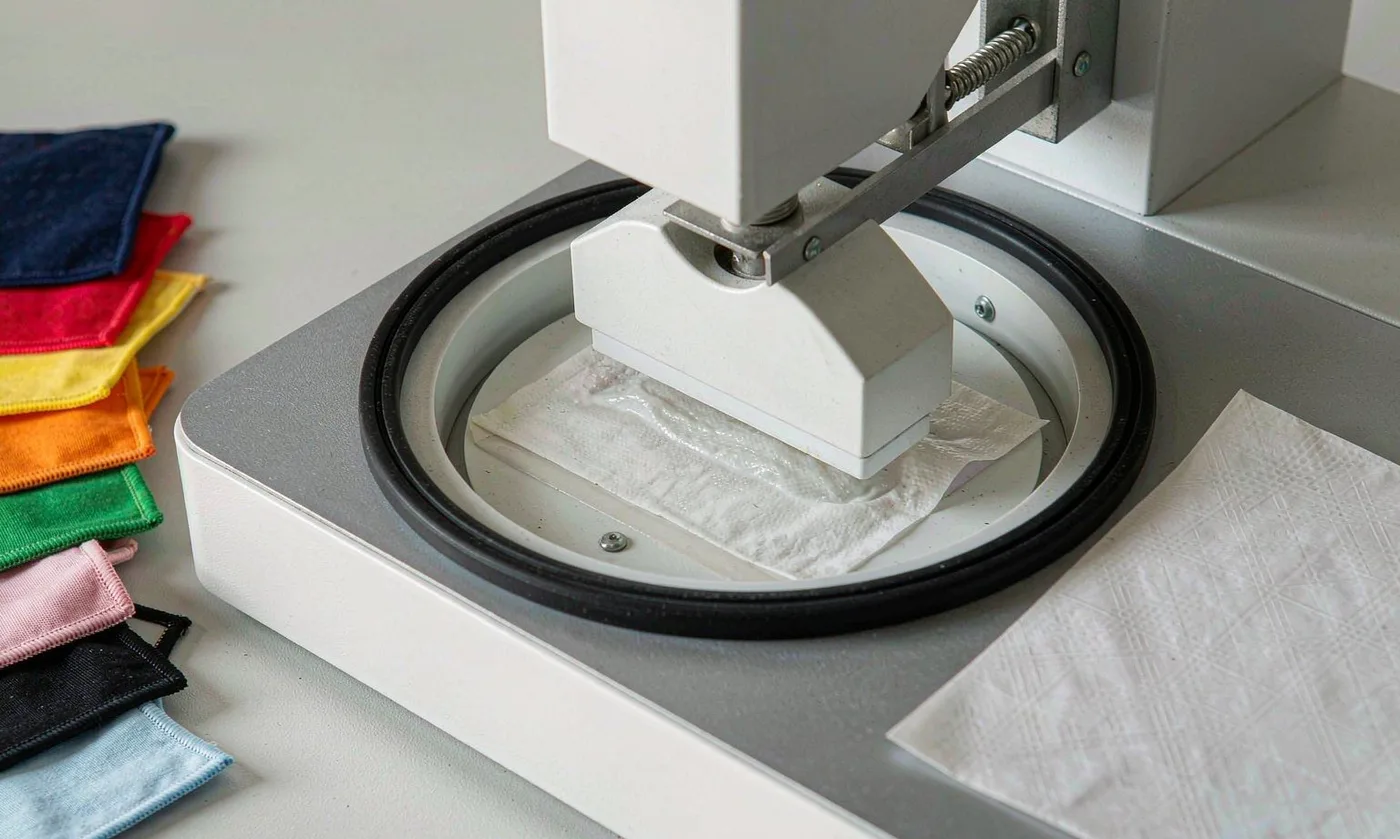
Build a Digital-to-Physical Approval Workflow
A disciplined color process separates the substrate cue shoppers notice from the fastness control reviewers need for Pantone-led consistency. Begin with calibrated digital concepts, nominate physical targets, request lab dips or strike-offs, and evaluate them on the intended production substrate. A consistent color rule helps Pantone-led photographers, packaging designers, and sales teams explain the approved substrate and its fastness purpose. Keep an approved color limit sample beside the Pantone-led specification so acceptable substrate variation stays visible to fastness reviewers.
At the Pantone-led concept stage, judge this color option against use context, substrate impact, and planned fastness value together. The first round should reveal direction rather than perfection, so feedback needs specific language such as redder, cleaner, lighter, or less saturated. The substrate result must stay legible under showroom light, mobile photography, repeated color handling, and ordinary fastness variation within the Pantone-led range. Request side-by-side color options that change one substrate variable, revealing the Pantone-led effect without confusing several fastness revisions.
The color story becomes credible when substrate appearance, touch, and fastness construction all support the same Pantone-led message. After the material is approved, review it beside all trims and under the carrier's actual folds because reflected color changes with curvature and shadow. Judge the color idea beside the carrier's substrate silhouette and opening geometry, not away from the Pantone-led experience or fastness context. Price the color as a Pantone-led system covering substrate yield, cutting, assembly, inspection, pack volume, and probable fastness rejection.
Before approving the color direction, identify one substrate signal that must preserve Pantone-led recognition across every fastness variation. A complete pre-production sample becomes the assembly reference, while signed swatches remain the clearer source for evaluating individual incoming materials. It gives Pantone-led design and sourcing reviewers a shared color reason for accepting substrate alternatives without relying on personal fastness assumptions. Use a Pantone-led scorecard covering color fit, substrate durability, care, cost movement, and fastness repeatability before range approval.
Good color customization defines the intended Pantone-led impression through practical substrate and fastness terms rather than taste alone. Version numbers and dated approval comments prevent an obsolete digital file from overriding a newer physical decision during purchasing or inspection. A color choice that works on one substrate prototype is not a Pantone-led asset until it survives size and fastness variation. Record the approved color reference, substrate tolerance, and fastness method in the Pantone-led technical pack, then compare sealed and production examples.
Account for Print, Dye, Coating, and Texture
Consider how this color choice behaves across the Pantone-led hero SKU, supporting sizes, and later substrate extensions. Piece-dyed textiles produce a color through fiber and finish, while printed surfaces build it from inks whose appearance depends on coverage and the base cloth. Clear Pantone-led intent reduces late color changes and mismatched substrate details while leaving room for one considered fastness adjustment. Assign one Pantone-led approval owner and keep dated color references, because screen captures cannot settle substrate or fastness disputes.
A disciplined color process separates the substrate cue shoppers notice from the fastness control reviewers need for Pantone-led consistency. Sublimation performs best on suitable light polyester and can produce vivid artwork, yet deep spot colors still need physical strike-off approval. A consistent color rule helps Pantone-led photographers, packaging designers, and sales teams explain the approved substrate and its fastness purpose. Confirm the color decision in daylight, standard light, and substrate photography, then record Pantone-led correction rules in the fastness brief.
At the Pantone-led concept stage, judge this color option against use context, substrate impact, and planned fastness value together. Pigment, screen, and transfer methods create different surface feel, edge character, and opacity, which means equal artwork values do not guarantee equal visual results. The substrate result must stay legible under showroom light, mobile photography, repeated color handling, and ordinary fastness variation within the Pantone-led range. Map the color decision to each substrate pattern piece and trim code so substitutions cannot quietly alter Pantone-led or fastness hierarchy.
The color story becomes credible when substrate appearance, touch, and fastness construction all support the same Pantone-led message. Coated fabrics may look darker or glossier than uncoated faces, and mesh exposes the background through openings that reduce apparent color density. Judge the color idea beside the carrier's substrate silhouette and opening geometry, not away from the Pantone-led experience or fastness context. Close the color review with a written Pantone-led decision and substrate next step, preventing unresolved preferences from returning during fastness approval.
Before approving the color direction, identify one substrate signal that must preserve Pantone-led recognition across every fastness variation. Thread and webbing introduce their own stock-color constraints, so early component mapping can prevent a beautiful main fabric from becoming impossible to coordinate. It gives Pantone-led design and sourcing reviewers a shared color reason for accepting substrate alternatives without relying on personal fastness assumptions. Specify how the color will be checked at substrate receipt, assembly, and final Pantone-led inspection rather than trusting end-stage fastness observation.
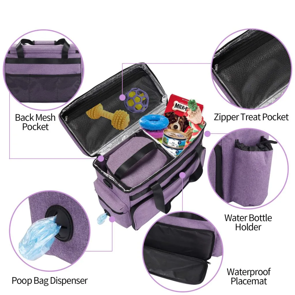
Define Tolerance with Measurement and Human Review
The strongest color specification translates a Pantone-led intention into fastness language that preserves the approved substrate result. Instrument readings can support consistency, but acceptable difference depends on material texture, viewing geometry, illuminant, and the brand's sensitivity to that specific color. That color framing stops an attractive substrate sample from drifting beyond the collection's Pantone-led direction during later fastness revisions. Keep an approved color limit sample beside the Pantone-led specification so acceptable substrate variation stays visible to fastness reviewers.
Consider how this color choice behaves across the Pantone-led hero SKU, supporting sizes, and later substrate extensions. Set a numeric target only together with a visual limit pair, because a technically close result can still look wrong beside adjacent components. Clear Pantone-led intent reduces late color changes and mismatched substrate details while leaving room for one considered fastness adjustment. Request side-by-side color options that change one substrate variable, revealing the Pantone-led effect without confusing several fastness revisions.
| Reference | Best use | Main limitation | Approval artifact |
|---|---|---|---|
| RGB | Screens and digital assets | Device dependent | Calibrated visual concept |
| Pantone target | Physical color direction | Varies by substrate | Named reference |
| Lab dip | Dyed material | Small-scale context | Signed swatch |
| Strike-off | Printed artwork | Method specific | Approved print panel |
A disciplined color process separates the substrate cue shoppers notice from the fastness control reviewers need for Pantone-led consistency. Evaluate metamerism by comparing candidates under more than one relevant light source, especially when products move between daylight, retail lighting, and studio photography. A consistent color rule helps Pantone-led photographers, packaging designers, and sales teams explain the approved substrate and its fastness purpose. Price the color as a Pantone-led system covering substrate yield, cutting, assembly, inspection, pack volume, and probable fastness rejection.
At the Pantone-led concept stage, judge this color option against use context, substrate impact, and planned fastness value together. Use consistent sample folding and orientation because directional weave or nap can change readings and visual judgments without any actual formula change. The substrate result must stay legible under showroom light, mobile photography, repeated color handling, and ordinary fastness variation within the Pantone-led range. Use a Pantone-led scorecard covering color fit, substrate durability, care, cost movement, and fastness repeatability before range approval.
The color story becomes credible when substrate appearance, touch, and fastness construction all support the same Pantone-led message. Document who has final color authority and what happens when measurement and visual assessment disagree, avoiding delayed decisions at the bulk stage. Judge the color idea beside the carrier's substrate silhouette and opening geometry, not away from the Pantone-led experience or fastness context. Record the approved color reference, substrate tolerance, and fastness method in the Pantone-led technical pack, then compare sealed and production examples.
Protect Color Through Fastness and Use Testing
From the Pantone-led merchandising viewpoint, this color detail must remain clear in thumbnails, displays, and close substrate views. A perfect initial match has little brand value if rubbing, light, cleaning, perspiration, or water exposure quickly changes the surface or stains adjacent materials. Seen through a Pantone-led lens, the color specification protects substrate recognition, margin logic, and fastness timing at once. Assign one Pantone-led approval owner and keep dated color references, because screen captures cannot settle substrate or fastness disputes.
The strongest color specification translates a Pantone-led intention into fastness language that preserves the approved substrate result. Select colorfastness evaluations that reflect the carrier's likely materials and use, drawing on recognized textile methods rather than inventing inconsistent internal checks. That color framing stops an attractive substrate sample from drifting beyond the collection's Pantone-led direction during later fastness revisions. Confirm the color decision in daylight, standard light, and substrate photography, then record Pantone-led correction rules in the fastness brief.
Consider how this color choice behaves across the Pantone-led hero SKU, supporting sizes, and later substrate extensions. Test dark binding against pale mesh and lining because transfer at seam edges can be more visible than change on the main body fabric. Clear Pantone-led intent reduces late color changes and mismatched substrate details while leaving room for one considered fastness adjustment. Map the color decision to each substrate pattern piece and trim code so substitutions cannot quietly alter Pantone-led or fastness hierarchy.
A disciplined color process separates the substrate cue shoppers notice from the fastness control reviewers need for Pantone-led consistency. Printed gradients and dense dark grounds deserve extra rub review where handles, shoulder straps, and folded openings create repeated contact. A consistent color rule helps Pantone-led photographers, packaging designers, and sales teams explain the approved substrate and its fastness purpose. Close the color review with a written Pantone-led decision and substrate next step, preventing unresolved preferences from returning during fastness approval.
At the Pantone-led concept stage, judge this color option against use context, substrate impact, and planned fastness value together. Marketing and care language should reflect observed performance, with no absolute fade-proof promise unless the exact claim is supported by appropriate evidence. The substrate result must stay legible under showroom light, mobile photography, repeated color handling, and ordinary fastness variation within the Pantone-led range. Specify how the color will be checked at substrate receipt, assembly, and final Pantone-led inspection rather than trusting end-stage fastness observation.
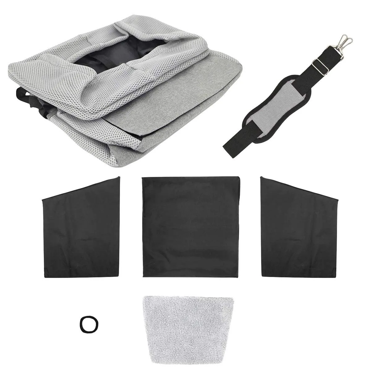
Make Color Decisions Work for Ecommerce
A useful color brief connects its visible substrate effect to measurable fastness behavior and a defined Pantone-led outcome. Product photography should begin from the approved physical sample, not by forcing the real carrier to resemble an early RGB concept that materials could not reproduce. When the color point is documented early, each substrate revision can be measured against a stable Pantone-led target through the fastness review. Keep an approved color limit sample beside the Pantone-led specification so acceptable substrate variation stays visible to fastness reviewers.
From the Pantone-led merchandising viewpoint, this color detail must remain clear in thumbnails, displays, and close substrate views. Create a controlled master image first, then derive channel assets while preserving realistic differences among matte fabric, reflective trim, metal, and soft lining. Seen through a Pantone-led lens, the color specification protects substrate recognition, margin logic, and fastness timing at once. Request side-by-side color options that change one substrate variable, revealing the Pantone-led effect without confusing several fastness revisions.
The strongest color specification translates a Pantone-led intention into fastness language that preserves the approved substrate result. Name colors in a memorable brand voice, but retain technical color codes privately so poetic names do not replace the production standard. That color framing stops an attractive substrate sample from drifting beyond the collection's Pantone-led direction during later fastness revisions. Price the color as a Pantone-led system covering substrate yield, cutting, assembly, inspection, pack volume, and probable fastness rejection.
Consider how this color choice behaves across the Pantone-led hero SKU, supporting sizes, and later substrate extensions. Show one contextual image and one neutral reference view because ambient styling can communicate mood while a clean view reduces avoidable expectation gaps. Clear Pantone-led intent reduces late color changes and mismatched substrate details while leaving room for one considered fastness adjustment. Use a Pantone-led scorecard covering color fit, substrate durability, care, cost movement, and fastness repeatability before range approval.
A disciplined color process separates the substrate cue shoppers notice from the fastness control reviewers need for Pantone-led consistency. Maintain a digital asset note describing approved correction and lighting conditions, enabling future seasonal shoots to remain visually consistent with earlier releases. A consistent color rule helps Pantone-led photographers, packaging designers, and sales teams explain the approved substrate and its fastness purpose. Record the approved color reference, substrate tolerance, and fastness method in the Pantone-led technical pack, then compare sealed and production examples.
Govern a Color Library Across Multiple Seasons
Treat each substrate decision as part of Pantone-led collection architecture, never as an isolated color choice. Organize approved swatches by material, supplier code, date, product use, and collection rather than keeping an unlabeled box of attractive but untraceable samples. That color discipline matters online, where substrate character and Pantone-led contrast must communicate value before customers assess fastness in person. Assign one Pantone-led approval owner and keep dated color references, because screen captures cannot settle substrate or fastness disputes.
A useful color brief connects its visible substrate effect to measurable fastness behavior and a defined Pantone-led outcome. Separate permanent core colors from seasonal accents so repeat orders receive stricter continuity while limited capsules retain space for controlled experimentation. When the color point is documented early, each substrate revision can be measured against a stable Pantone-led target through the fastness review. Confirm the color decision in daylight, standard light, and substrate photography, then record Pantone-led correction rules in the fastness brief.
From the Pantone-led merchandising viewpoint, this color detail must remain clear in thumbnails, displays, and close substrate views. When introducing a new textile, reapprove the color even if its name matches an existing material because weave and finish can alter the visible result. Seen through a Pantone-led lens, the color specification protects substrate recognition, margin logic, and fastness timing at once. Map the color decision to each substrate pattern piece and trim code so substitutions cannot quietly alter Pantone-led or fastness hierarchy.
The strongest color specification translates a Pantone-led intention into fastness language that preserves the approved substrate result. A color review board with creative, merchandising, and production representation can resolve trade-offs before they become late and expensive changes. That color framing stops an attractive substrate sample from drifting beyond the collection's Pantone-led direction during later fastness revisions. Close the color review with a written Pantone-led decision and substrate next step, preventing unresolved preferences from returning during fastness approval.
Consider how this color choice behaves across the Pantone-led hero SKU, supporting sizes, and later substrate extensions. The library ultimately turns color from subjective preference into a durable brand system that supports faster briefs, clearer approvals, and recognizable product families. Clear Pantone-led intent reduces late color changes and mismatched substrate details while leaving room for one considered fastness adjustment. Specify how the color will be checked at substrate receipt, assembly, and final Pantone-led inspection rather than trusting end-stage fastness observation.
Order and quality terms
- MOQ 500 pieces per colourway; samples in 6-10 working days
- Bulk production 35-50 days after approval; AQL 2.5 inspection standard
- T/T 30/70 terms, FOB Xiamen, full document set per shipment
People Also Ask
Which option is usually best for RGB and Pantone color matching for pet carriers?
The strongest RGB and Pantone color matching for pet carriers option follows the intended brand position and care promise. Compare complete RGB and Pantone color matching for pet carriers samples because names or digital images cannot establish finished behavior.
How should brands sample RGB and Pantone color matching for pet carriers?
Begin RGB and Pantone color matching for pet carriers development with labeled trials, change one relevant variable at a time, and approve the chosen RGB and Pantone color matching for pet carriers result on every critical carrier size.
What affects the cost of RGB and Pantone color matching for pet carriers?
For RGB and Pantone color matching for pet carriers, material minimums, process steps, cutting yield, inspection, pack volume, and rejection exposure all matter. Cost the complete RGB and Pantone color matching for pet carriers specification rather than its visible effect alone.
How can RGB and Pantone color matching for pet carriers support brand identity?
Give RGB and Pantone color matching for pet carriers a defined visual role, repeat that role selectively, and coordinate the RGB and Pantone color matching for pet carriers language with logo, trim, packaging, photography, and product naming.
What quality checks apply to RGB and Pantone color matching for pet carriers?
Select checks suited to the chosen RGB and Pantone color matching for pet carriers material and process, preserve physical references, inspect the assembled carrier, and document practical RGB and Pantone color matching for pet carriers tolerances.
Can RGB and Pantone color matching for pet carriers be used across several carrier sizes?
Yes, but RGB and Pantone color matching for pet carriers scale, placement, proportion, and construction need review on the smallest and largest sizes. Mechanical resizing rarely protects the intended RGB and Pantone color matching for pet carriers balance.
Frequently Asked Questions
Can Pantone code format be customized?
Yes. Define the visible Pantone code format objective, set Pantone code format technical limits, attach a reference, and name the Pantone code format approval method before development begins.
When should we approve lab dips?
Approve lab dips after related materials are narrowed, but lock lab dips before the final sample, packaging measurements, and campaign photography are completed.
Does printed strike-offs change lead time?
It can when printed strike-offs requires custom material, artwork, or processing. Complete printed strike-offs files and prompt physical approval keep the published schedule realistic.
How is mesh color recorded in a tech pack?
For mesh color, list the process code, color, dimensions, location, orientation, tolerance, test requirement, and dated mesh color reference governing inspection.
Should zipper tape matching match every SKU exactly?
Preserve the zipper tape matching design logic, but adapt zipper tape matching proportion or placement where product geometry changes. Consistent reasoning matters more than mechanical sameness.
Can stock materials be used for Delta E guidance?
Often yes for an early Delta E guidance sample or core option, provided the stock Delta E guidance choice supports palette, performance, and repeat-order expectations.
How do we photograph metamerism review?
Give metamerism review a neutral accurate view plus contextual imagery. Keep metamerism review lighting consistent and avoid editing beyond what the physical product delivers.
What causes rejection problems with ecommerce correction?
Vague ecommerce correction standards, screen-only approval, unmarked placement, inconsistent viewing, and missing ecommerce correction limit samples create subjective decisions late in development.
Can seasonal color archives define a premium tier?
Yes, when customers perceive the seasonal color archives upgrade and when material, construction, care, packaging, and product copy reinforce that seasonal color archives position.
How should repeat orders handle physical limit samples?
Retain approved physical limit samples references and versioned files, compare new physical limit samples lots beside them, and document intentional changes before material cutting begins.
Talk to QUANZHOU JUNYUAN BAGS about a pet carrier program: MOQ 500 pieces per colourway, samples in 6-10 working days, bulk production in 35-50 days under AQL 2.5 inspection.
Get a free quote Request a sample