Brand Collab: Co-Branded Products
Bespoke pet carrier development runs 6-10 working days to a first sample and 35-50 days to bulk after approval, both measured from a confirmed tech pack.
Choosing the collaboration architecture
Collaborations fail when the two parties have different ideas about what they are doing. Three architectures cover almost every real case, and naming the one you are in removes most of the ambiguity that follows.
The first is the capsule: one brand's product carrying a second brand's mark for a defined window. It is the most common and the clearest commercially, because both parties know the scope, the duration and the exit.
The second is the endorsement: a specialist brand's credibility applied to a generalist's range. This is common with veterinary, training or outdoor specialists, and it changes the artwork hierarchy significantly, because the endorsing mark carries the persuasive weight.
The third is the genuine co-design, where both marks sit on a product neither would have made alone. It generates the most press and carries the most risk, because there is no precedent to resolve disagreements against and the development path is genuinely unknown.
- Capsule: defined window, clearest scope, easiest to repeat or retire.
- Endorsement: credibility transfer, endorsing mark carries persuasion.
- Co-design: highest press value, highest development risk, needs clear governance.
- Charity tie-in: cause-led, artwork rules are usually strict, strong goodwill.
Write the architecture into a short agreement before design starts. It should state the scope, the window, who approves what and what happens to leftover stock, and it should be short enough that both parties actually read it.
Audience overlap deserves honest analysis rather than optimism. The strongest collaborations reach a genuinely new audience for at least one partner; the weakest sell the same product to the same people twice and produce no incremental demand.
Finally, decide the exit at the start. Whether the capsule ends cleanly, converts to a permanent line or triggers a second drop is a decision that shapes the packaging, the volume and the marketing, and it is far easier to make early than late.
Logo hierarchy and artwork governance
Two marks on one product is a design problem with a legal dimension, and the solution is a hierarchy both parties approve in writing. The questions are which mark is larger, which appears first, where each sits and what the separation rule is.
Equal treatment is the tempting answer and usually the wrong one. Two marks at identical size read as indecision, and on a small product they compete rather than reinforce. A clear primary and a clear secondary reads as designed, and both parties generally accept it once the reasoning is explained.
Position should follow the product rather than the negotiation. The primary mark goes on the surface customers photograph; the secondary mark goes where it is legible but does not compete, typically a woven tab, a lining print or the packaging reverse.
- Size ratio: agree a ratio and apply it consistently across every SKU.
- Clear space: a defined gap between the two marks, never touching.
- Order of appearance: stated once and applied to product and marketing alike.
- Permitted colourways: which combinations of the two identities are allowed.
- Prohibited treatments: what neither party may do to the other's mark.
File control matters as much as hierarchy. Both parties should supply master vector artwork, and neither mark should ever be redrawn downstream. A single controlled artwork folder prevents the slow drift that produces a rejected production sample.
Name one approver per brand and record it. Collaborations stall when each side believes the other is reviewing, and a written approval matrix with named people and expected response times is the cheapest insurance available.
Plan one revision round into the schedule. Dual-brand artwork almost always comes back with a note about scale, clear space or colourway, and assuming first-pass approval is what compresses the calendar later.
Archive the signed artwork and the approval note with the SKU record. When a second drop is discussed a year later, that record turns a renegotiation into a scheduling conversation.
Reconciling two colour systems on one product
Every brand has a colour system, and two brands rarely share one. The collaboration therefore needs a defined palette that respects both identities without producing a product that looks like neither, which is a design problem with a clear method.
Start by listing both palettes and identifying the overlap. Most brand palettes share a neutral or a dark ground, and that shared element becomes the base of the collaboration palette. Building on overlap is faster and produces a more coherent result than negotiating a compromise colour.
Then assign roles. One brand's colour typically dominates the product, the other's appears as an accent on trim, lining or packaging. This mirrors the logo hierarchy and reinforces it, so the product reads as one design with two signatures rather than two designs sharing a surface.
| Palette element | Typical source | Application | Match difficulty | Approval artefact |
|---|---|---|---|---|
| Primary ground | Lead brand | Shell fabric | Moderate | Lab dip on production base |
| Accent colour | Partner brand | Binding, webbing, lining | Moderate | Strike-off on each substrate |
| Neutral base | Shared | Hardware, labels | Low | Standard reference |
| Mark colours | Both, unchanged | Embroidery or print | High | Decorated swatch |
| Packaging ground | Partner brand or neutral | Card or box | Low | Printed proof |
Do not blend the two marks' colours into a new shade. It seems diplomatic and it satisfies nobody, because both brands see their identity altered. Keep each mark in its own approved colours and let the palette do the reconciling.
Approve colour on production substrates under one controlled light source, exactly as you would for a licensed programme. Deep saturated brand colours shift most between lighting conditions, and a single specified source prevents the argument.
Reference the colour system to a recognised standard rather than to a screen capture. Nominating a Pantone reference per element gives both parties a shared language, and the standards published by Pantone are the common reference point for exactly this conversation.
Document the palette as a one-page standard that travels with the tech pack. It lists each element, its reference, where it appears and its tolerance, so a second drop or a reorder reproduces the collaboration rather than an approximation of it.
Selecting the capsule: which products carry two marks
Not every product carries a collaboration equally well. The best capsule items have three properties: a surface large enough for two marks, a price point that supports the story, and a use case both audiences share.
Walking sets are the reliable workhorses. A collar and lead set offers long flat surfaces for both marks, sits at an accessible price point and is used daily, which means the collaboration is seen repeatedly rather than once.
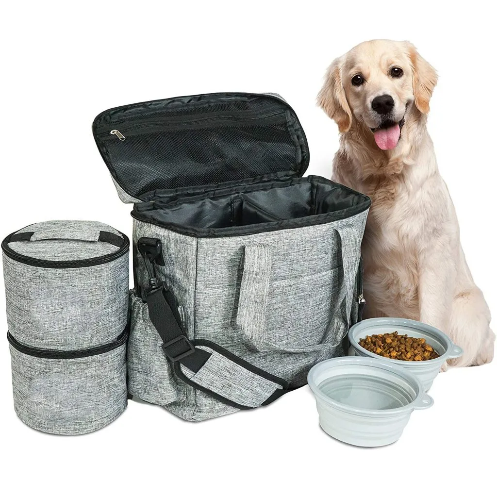
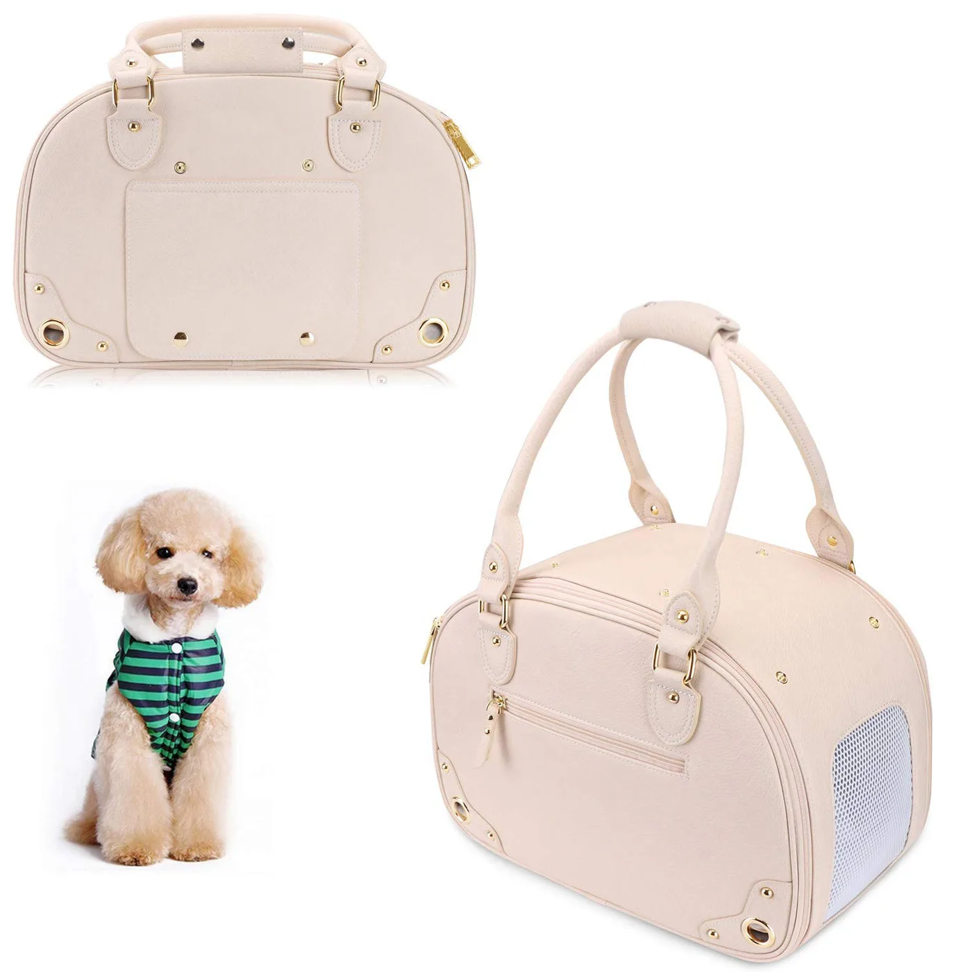
Travel carriers are the statement items. They carry the largest display area, they justify a higher price and they photograph well, which matters when both brands are promoting the drop to their own audiences.
- Collar and lead set: best surface-to-price ratio, everyday visibility.
- Travel carrier: largest display area, statement piece, higher price point.
- Bandana or accessory: low entry price, strong impulse and gift purchase.
- Bedding or mat: home-adjacent, works for lifestyle and interior brands.
- Toy or treat item: gift price point, good for charity and cause tie-ins.
Four to six SKUs is the practical capsule size. Fewer and the drop does not look like a collection in a single marketing frame; more and you have committed to multiple colourway minimums on a product whose demand is genuinely uncertain.
Weight the buy toward one hero item. A capsule that sells out of its hero and holds five slow movers has underperformed even if every item was well made, because the collaboration's value was concentrated in the piece both audiences wanted.
Where the two brands have very different price positions, choose the product that sits between them rather than at either extreme. A premium brand's audience will accept a mid-price collaboration item; a value brand's audience will not accept a premium one.
Finally, plan one item that is genuinely exclusive to the collaboration rather than an existing product with a second mark added. Exclusivity is what makes a drop newsworthy, and it is the difference between a collaboration and a co-marketing exercise.
Decoration methods for dual marks
Two marks usually need two methods, because they have different detail levels and because placing both in the same technique makes them compete visually. Using different methods is not a compromise; it is how the hierarchy is expressed physically.
Embroidery suits the primary mark on a woven or canvas shell. It reads as considered and durable, but it requires simplified artwork and a size above roughly 40 mm to stay legible, which is a real constraint for detailed logos.
The secondary mark is usually better as a woven label or a small print. Woven labels hold fine detail at small sizes, sit flat and cost little, which makes them the natural vehicle for a mark that should be present but not dominant.
- Embroidery: primary mark, durable, needs simplified artwork and scale.
- Woven label: secondary mark, fine detail at small size, flat and cheap.
- Heat transfer: full-colour marks, check wash durability carefully.
- Dye-sublimation: photographic colour on polyester grounds, no hand-feel change.
- Rubber patch: durable on technical shells, one tooling cost per mark.
Lining print is the underused option for the secondary mark. A repeated pattern or a single mark printed on the interior fabric is visible when the product is opened or turned, it never competes with the exterior, and it costs very little.
Hardware can carry a mark too, and it is often the most durable position available. A debossed or laser-marked buckle survives abrasion far better than any fabric decoration and reads as a premium detail.
Test decorated samples for wash and rub fastness, particularly where two methods sit close together. Referencing recognised textile methods from AATCC gives the specification a shared language, and testing at sample stage costs a fraction of testing after a complaint.
Approve both marks together on one physical sample. A mark approved in isolation and then combined on the product frequently needs scale adjustment, and discovering that on the combined sample is far cheaper than discovering it in production.
Packaging as the shared stage
Packaging is where a collaboration is either explained or wasted. Two marks on a product with no context look like a licensing deal; the same product with packaging that tells the story reads as an event, and events sell.
The packaging face should carry both marks with the agreed hierarchy and one line explaining the collaboration. That line does more commercial work than any other element, because it converts confusion into interest at the point where the customer is deciding.
- Mark hierarchy: agreed ratio, consistent with the product application.
- Collaboration line: one short sentence explaining why the two brands are together.
- Shared neutral ground: prevents either brand colour dominating the card.
- Edition marking: a visible indicator that this is a limited run.
- Cross-reference panel: shows the other items in the capsule.
Edition marking deserves particular attention. A numbered or otherwise marked edition creates the scarcity that makes a drop work, and it costs nothing beyond a line of artwork and a decision about how many units exist.
Unboxing should be designed as a shared stage rather than as protection. If both brands are promoting the drop, the opening sequence will appear in content from both sides, and a considered interior, printed lining paper or a simple insert card is what makes that content worth publishing.
Keep the packaging architecture reusable. A template that works for this collaboration can carry the next one with new artwork, which reduces both cost and lead time for the second drop and makes a repeat genuinely attractive.
Finally, confirm any required credit or legal text early. Collaborations often carry trademark or copyright lines for both parties, and designing the layout around them is simpler than retrofitting them later.
Launch mechanics: making scarcity work
A collaboration is a timed event, and the mechanics of the drop determine whether it feels valuable or merely unavailable. Scarcity works when it is credible, explained and finite; it backfires when customers conclude they were manipulated.
Announce the window rather than just the product. Stating that a capsule runs for a defined period, or that a defined number of units exist, converts interest into action, and it gives both marketing teams a reason to post twice rather than once.
- Stated quantity: a specific number is more credible than vague scarcity.
- Defined window: a closing date creates urgency without discounting.
- Simultaneous launch: both brands publish at the same moment.
- Allocation: agree in advance how stock splits between the two channels.
- Post-drop position: state whether anything continues afterwards.
Allocation is the most common source of tension after the drop. Agreeing the split between the two brands' channels, and the process for reallocating if one sells out, prevents the awkward conversation that otherwise happens at exactly the wrong moment.
Simultaneity matters more than it appears. If one brand publishes first, the other's audience arrives to find stock already committed, which reads as favouritism and wastes half the collaboration's reach.
Plan the second post before the first. Collaborations generate their strongest interest in the first forty-eight hours, and having a second content moment ready, a making-of, a designer note or a restock announcement, extends the window considerably.
Finally, decide the afterlife in advance. Whether remaining stock is retired, discounted or absorbed into one brand's permanent range should be agreed before launch, because deciding it during the drop is when collaborations turn into disputes.
Timeline, approvals and legal checkpoints
A collaboration has more approval steps than an ordinary programme, and the schedule should be built to absorb them rather than to ignore them. Working backwards from the launch date is the only reliable method, and it needs more buffer than most first collaborations allow.
The longest block is usually dual artwork approval. Two organisations reviewing the same drawing rarely do it in parallel, so build the schedule around sequential review with a stated response time per party rather than assuming concurrency.
- Artwork approval: sequential by party, allow a revision round.
- Colour approval: strike-offs on every substrate, both parties sign.
- Sampling: 6-10 working days once both marks are approved.
- Legal checkpoints: trademark usage, credit lines, any licence requirements.
- Bulk production: 35-50 days after written approval.
Legal checkpoints are the step most often discovered late. Trademark usage rules, required credit lines and any territory restrictions should be confirmed before artwork is finalised, because a change at that stage affects tooling, packaging and marketing simultaneously.
Place the schedule buffer before bulk production. A buffer after production protects nothing, since by then the launch date is already at risk and the only remaining options are expensive.
Confirm payment and shipping terms early so they are not a variable in an already complex plan. Standard terms are T/T with a 30% deposit and 70% balance before shipment, quoted FOB Xiamen, with inspection to AQL 2.5 on finished cartons before loading.
Finally, hold one combined approval sample signed by both parties. It is the reference that settles any later disagreement about what was agreed, and it is far cheaper to keep than to reconstruct.
Cost structure, MOQ and after the drop
Collaborations carry cost elements that ordinary programmes do not, and understanding them before quoting prevents the uncomfortable conversation that happens when a capsule turns out more expensive than either party expected.
The dominant variable is decoration tooling. Each mark reproduced in embroidery needs digitisation, and each reproduced as a patch needs tooling, so a capsule using two marks across two methods carries four development charges before a single unit is made.
Colour development is the second. A collaboration palette developed on five substrates is a real cost, and it is paid once if the substrates are standardised across the capsule and repeatedly if every SKU uses something different.
| Cost element | Capsule impact | One-time or per unit | Reduction lever | Notes |
|---|---|---|---|---|
| Mark digitisation | Per mark, per method | One-time | Reuse one method per mark | Amortises across capsule volume |
| Patch tooling | Per mark | One-time | Use existing tooling where possible | Justified above mid volumes |
| Colour development | Per substrate | One-time | Standardise substrates | Paid repeatedly if unstandardised |
| Packaging artwork | Per SKU | One-time | Use one reusable template | Template carries future drops |
| Unit production | Per piece | Per unit | Volume above minimum | MOQ 500 per colourway |
MOQ is 500 pieces per colourway. Because a collaboration palette is usually small, several SKUs can be combined to reach one colourway minimum, which is how a four to six item capsule stays commercially viable.
Reorders during a drop deserve a specific decision. Because the value of a collaboration is partly scarcity, a reorder that arrives after the window has closed can undermine the positioning, so agree the reorder policy before launch rather than debating it mid-drop.
Independent verification is worth including where either brand has a compliance function. Third-party review through SGS gives both parties a document rather than an assurance, which is usually what unblocks an internal approval.
After the drop, conduct a short review with the partner while the detail is fresh. What sold out, what did not and what approval step cost the most time are the three questions that make a second collaboration materially better than the first.
Finally, archive everything as a reusable kit: artwork, palette standards, decoration specifications and packaging templates. A second collaboration with the same partner then becomes a production task rather than a development one, which is where the real economics of collaboration programmes live.
Two additional practices make that kit genuinely reusable. The first is a written collaboration brief template, covering architecture, hierarchy, palette, channels and exit, which turns the next conversation from a blank page into a checklist. The second is a single retained sample set per drop, signed by both parties, which resolves any later disagreement about what was approved without reopening the design conversation.
Programmes that adopt both tend to move from one collaboration to a series, and a series is where the audience crossover effect compounds. The first drop introduces two audiences to each other; the second one converts them, because by then the collaboration is a known thing rather than a novelty.
Order and quality terms
- MOQ 500 pieces per colourway; samples in 6-10 working days
- Bulk production 35-50 days after approval; AQL 2.5 inspection standard
- T/T 30/70 terms, FOB Xiamen, full document set per shipment
People Also Ask
What makes a brand collaboration successful?
A clear architecture, a written logo hierarchy, an agreed colour palette and one genuinely exclusive product. Most failures are governance problems rather than production problems.
Should the two logos be the same size?
No. Equal sizing reads as indecision on a small product. A clear primary and secondary, expressed through size, position and decoration method, reads as designed.
How do you combine two brand colour palettes?
Build on the overlap: find a shared neutral or dark ground, give one brand the product colour and the other the accent, and keep each mark in its own approved colours.
Which decoration method suits a secondary mark?
A woven label or a lining print. Both hold fine detail at small sizes, sit flat and cost little, which is right for a mark that should be present without competing with the primary.
How should a limited drop be announced?
With a stated quantity or a defined closing window, published simultaneously by both brands. Specific numbers are more credible than vague scarcity and give both audiences a reason to act.
What happens to leftover stock after a drop?
Decide before launch. Retire it, discount it or absorb it into one brand's permanent range, but do not leave the decision until mid-drop, which is when collaborations turn into disputes.
Frequently Asked Questions
What is the MOQ for a co-branded capsule?
MOQ is 500 pieces per colourway. Because a collaboration palette is usually small, several SKUs can be combined to reach one colourway minimum, which keeps a four to six item capsule viable.
How should two logos be sized on one product?
With an agreed ratio rather than equal treatment. Two marks at identical size read as indecision on a small product, while a clear primary and secondary reads as designed and is usually accepted once explained.
Can both brands keep their own colours?
Yes, and they should. Blending two identities into a compromise shade satisfies nobody. Keep each mark in its own approved colours and let the collaboration palette do the reconciling.
Which products work best for a collaboration?
Collar and lead sets for surface-to-price ratio and daily visibility, travel carriers as the statement piece, and one genuinely exclusive item that gives the drop a reason to exist.
How many SKUs should a capsule include?
Four to six, weighted toward one hero item. Fewer does not look like a collection in a single marketing frame; more commits multiple colourway minimums on uncertain demand.
How long does sampling take?
6-10 working days once both marks are approved, including strike-offs of every decoration method in the capsule. Dual artwork approval is usually the longer block and should start in parallel.
What is the bulk production lead time?
35-50 days after written sample approval. Inspection runs to AQL 2.5 on finished cartons before loading, and standard terms are T/T 30/70 against FOB Xiamen.
How do we handle allocation between the two brands?
Agree it before launch, including the process for reallocating if one channel sells out. Allocation is the most common source of tension after a drop, and it is far easier to settle in advance.
Should the drop be restocked?
Decide before launch. Because scarcity is part of the value, a reorder arriving after the window can undermine the positioning, so the reorder policy belongs in the initial agreement.
What legal text is needed on packaging?
Usually trademark or credit lines for both parties, and any territory restrictions. Confirm the requirements before artwork is finalised, because late changes affect tooling, packaging and marketing together.
Can we reuse the packaging template later?
Yes. A reusable architecture with new artwork reduces both cost and lead time for a second drop, which makes repeating a successful collaboration genuinely attractive.
Do you archive collaboration specifications?
Yes. Artwork, palette standards, decoration specifications and packaging templates are archived as a reusable kit, so a second collaboration becomes a production task rather than a development one.
Talk to QUANZHOU JUNYUAN BAGS about a pet carrier program: MOQ 500 pieces per colourway, samples in 6-10 working days, bulk production in 35-50 days under AQL 2.5 inspection.
Get a free quote Request a sample